The New York Times created a public dataset tracking the spread of COVID-19 by county since the beginning of the year. This national, county-level dataset is a valuable resource for researchers and is a result of the collaborative effort journalists working across the country compiling information from public health authorities and other sources.
As noted by the Times, public health authorities have been overwhelmed as a result of their response to the pandemic, so third-party data collection efforts like their own can help to fill in gaps in data availability and provide the public & policymakers with timely and accurate information regarding the pandemic.
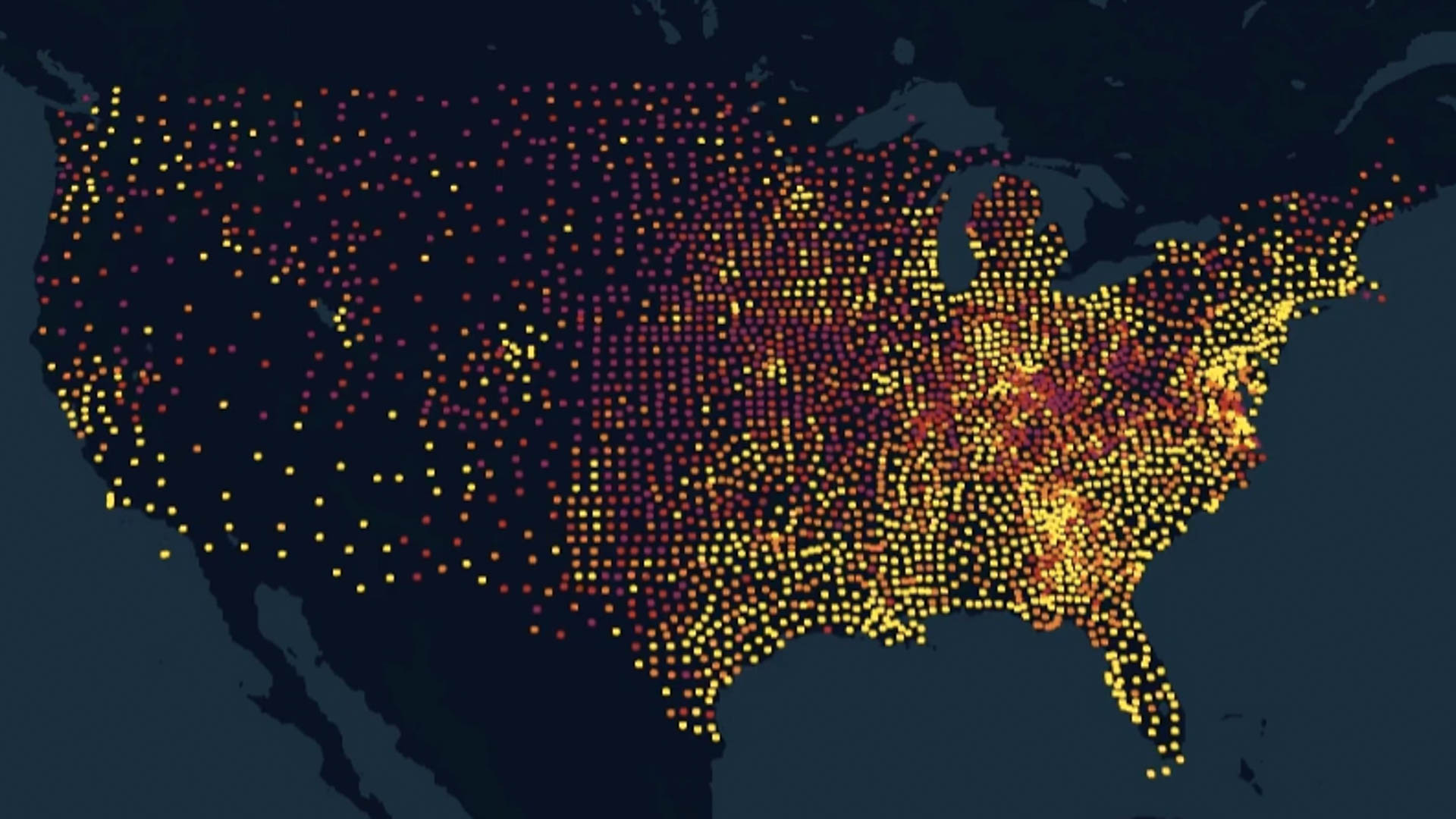
To visualize the spread of COVID-19 in the United States since the start of the pandemic, we processed and cleaned this dataset so that it could be joined with external GIS resources for the mapping component of this project.
We implemented Kepler.gl, an open-source mapping library created by Uber to produce interactive maps of COVID-19 cases and deaths in every U.S. county since January, 2020. Kepler is a powerful, scalable tool suitable for visualizing large scale datasets and includes functionality ideal for showing change over time.
Our visualizations cover the time period of January 21st to September 17th, 2020. Four different animated visualizations created from the data showing changes in COVID-19 cases and deaths over time are presented below.
COVID-19 Cases By County
Interactive map of COVID-19 cases by county. Each dot represents a single county and is colored based upon the number of COVID-19 cases for each day.
COVID-19 Hotspots by County
Like the previous map, this visualization shows COVID-19 cases by county. However, this map is set to increase the size of each county’s dot relative to the number of cases for each day.
COVID-19 Deaths by County
Interactive map of COVID-19 deaths by county. Each dot represents a single county and is colored based upon the number of COVID-19 deaths for each day.

